Cognac Rebrands – Recent Announcement from the BNIC
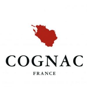
 Cognac rebrands. Its regulatory body, the BNIC, has just unveiled a new brand identity for the appellation which was officially recognised over a hundred years ago. The logo depicts a rich, copper still-coloured map of the growing region. Bordering the Atlantic ocean, the appellation is bisected by the river Charente and comprises 6 cognac crus. The newly designed logo reminds us that the King of all Spirits is the product of one place only. It is designed to be inspiring, like cognac itself. It should also convey to consumers the wonderful history of the region and craftmanship of the producers. Even the font used has historic connections. It was created by Claude Garamount in the 16th century, when Charente wine was first distilled. Speaking at the launch, Claire Caillaud, BNIC Director of Comms said ”[The logo] will reinforce cognac’s image as a product of guaranteed provenance and authenticity”.
